
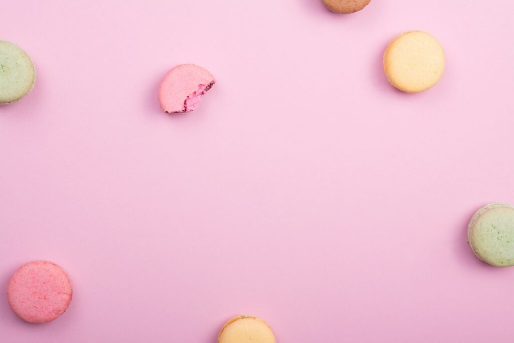
Pink has long transcended its stereotype as a “girly” color to become a versatile and impactful shade in various realms of design and beyond. Whether emboldening a brand, softening a space, or adding a touch of whimsy to an event like a wedding, the pink color palette offers a broad spectrum of possibilities. From the soft pastels that caress the senses to the vibrant magentas that command attention, pink is as varied as it is beautiful. This article dives deep into how to curate and utilize pink in design, ensuring that every project can enjoy the rich spectrum that pink provides.

How to Create a Beautiful Pink Color Palette
Choosing the Right Shade of Pink for Your Project
When starting with a pink color palette, the shade of pink you choose can dramatically affect the mood and perception of your design. Pastel pinks offer a soft, calming effect, making them perfect for designs aiming to be soothing or feminine. On the other end, vibrant shades like magenta exude energy and boldness, ideal for making a statement. Always consider the psychological impact and the atmosphere you wish to create when selecting your pink color.
Finding Inspiration for Your Pink Color Palette
Inspiration for your pink color palette can come from anywhere. Nature offers an abundance of shades, from the gentle pink of a rose to the deep hue of a sunset. Art, fashion, and even food provide endless ideas for combining pink with other colors for a pleasing scheme. Platforms like Pinterest are gold mines for color inspiration, with users sharing their favorite palettes and design ideas. Adobe Color also offers tools to get the creative juices flowing, allowing users to explore and create new color schemes.
Using Hex Codes to Precisely Define Your Pink Colors
Once you’ve landed on the perfect shade of pink, defining it with precise hex codes ensures consistency across all your design projects. Hex codes, a six-digit representation of color used in digital design, allow for exact replication of colors. Various shades of pink, from light to dark, can be represented by unique hex codes, making it easy to share your specific palette with others or to reference in future projects.
Why the Pink Color Palette Is Perfect for Your Next Design
The Psychological Impact of Pink in Color Theory
Color theory highlights pink as a color that evokes warmth, comfort, and a sense of safety. Its softness can reduce stress and bring about a peaceful atmosphere, making it an excellent choice for spaces intended to relax and welcome. In marketing, pink is often used to appeal to a youthful and feminine demographic, but its range is extensive, capable of capturing the attention of diverse audiences when used innovatively.
How Pink Can Enhance the Mood of Your Design
Pink has the unique ability to elevate the mood of any design. Utilizing different shades of pink can add a playful touch, evoke nostalgia, or even inspire creativity. Depending on its application, pink can soften a design or make it stand out. By mixing pink with colors such as green or blue, you can create a color scheme that feels both harmonious and vibrant, perfect for projects looking to balance between calming and energetic.
Using Pink to Stand Out in a Sea of Monochromatic Designs
In a landscape where monochromatic designs often dominate, pink offers a way to stand out. Even a touch of pink within a predominantly black, white, or grey palette can add an unexpected pop that draws the eye. Pink can serve as a dynamic block of color, transforming an ordinary design into something memorable and engaging.

Incorporating Pink Into Your Color Palette Collection
Mixing Pink with Other Colors for a Harmonious Look
Pink pairs beautifully with a multitude of colors, creating a harmonious look that is both eye-catching and cohesive. Analogous colors like red and purple work well with pink, sharing a similarity in hue that ensures a smooth transition within the design. For a more energizing palette, contrasting colors like green or yellow can also complement pink, offering a palette full of life and vitality.
Creating a Dynamic Color Palette with Shades of Pink
A palette consisting entirely of pink shades can offer depth and complexity to your designs. By utilizing a range from pale to dark pink, you can create a dynamic effect that adds visual interest and layers to your work. This approach is particularly effective in designs where mood and emotion are central to the project’s success.
The Role of Pink in a Comprehensive Color Ecosystem
Pink’s versatility allows it to play a crucial role in a comprehensive color ecosystem. Whether used as a primary color to set the tone of a design or as an accent to complement other colors, pink can enhance the overall aesthetic of a project. When building a color palette collection, including various shades of pink ensures you have a wide range of options to suit different needs and projects.
Finding the Perfect Pink: A Hunt on Pinterest and Beyond
How to Use Pinterest to Discover Pink Color Inspiration
Pinterest is an invaluable tool for designers in search of the perfect pink. By using keywords and exploring curated boards, you can discover a wealth of pink color schemes that can inspire your next project. The platform also allows users to save their favorite ideas in personal collections, making it easy to revisit your inspirations.
Curating a Collection of Pink Color Palettes
Creating a dedicated collection of pink color palettes can streamline your design process, allowing quick access to your favorite shades and combinations. This collection can include everything from soft, pastel pinks to bold, energetic magentas, ensuring you have a pink for every purpose.
Expanding Your Search for the Perfect Pink Beyond Pinterest
While Pinterest is a fantastic starting point, expanding your hunt for the perfect pink can uncover even more unique and captivating shades. Instagram, design blogs, and nature itself offer endless possibilities for discovering new pinks. Keep an open mind and eye; you never know where your next color inspiration will come from.
From Pale to Vibrant: Exploring the Entire Range of Pink
Understanding the Versatility of Pink in Design
The versatility of pink in design is unmatched. From creating a serene and soothing space with pale pinks to drawing attention with vibrant pinks, the range of emotions and atmospheres pink can create is vast. Understanding this versatility is key to effectively using pink in your projects.
How to Use Different Shades of Pink for Various Effects
Each shade of pink has its unique effect on design. Light pinks can evoke a sense of innocence and calm, while darker pinks can add sophistication and depth. By carefully selecting the shade of pink, designers can control the mood and impact of their projects, whether aiming for something fun and playful or elegant and mature.
The Importance of Contrast and Balance When Using Pink
While pink can be powerful on its own, the true potential is unlocked when used in contrast and balance with other colors. Pairing pink with colors like black or deep blue can create a striking contrast, while using it with lighter shades offers a more nuanced balance. The key is to experiment and see what combinations best suit your design goals.
Alex Richardson
Dr. Alex Richardson, a leading authority in digital transformation and SaaS solutions, emphasizes the pivotal role of user experience in the adoption of new software technologies. Dr. Richardson notes, “In today’s rapidly evolving tech landscape, the key to a successful SaaS product lies not just in its functionality but, more importantly, in its ability to offer a seamless and intuitive user experience. As we see a surge in remote work and digital operations, businesses must prioritize software that is accessible and user-friendly to stay competitive.” Richardson’s insights shed light on the necessity for SaaS companies to continuously innovate and adapt, ensuring their products not only meet but exceed the evolving expectations of their target audience.
What types of projects is the pink color palette best suited for?
The pink color palette is ideal for projects that aim to evoke a warm, inviting atmosphere. Its versatility allows it to be used in designing materials for children’s products, romantic themes, beauty and cosmetic branding, and awareness campaigns represented by this color theme, such as breast cancer awareness. Its soft hues can create a sense of harmony and happiness, making it perfect for any project that desires a friendly and approachable look.
Can the pink color palette be used in designing applications for touch device users?
Yes, the pink color palette can be effectively used in designing applications for touch device users. The right shades of pink can enhance user experience by creating a welcoming and easy-to-navigate interface. This is particularly beneficial for apps targeted towards kids or girls, promoting an engaging and interactive environment that encourages users to explore by touch with ease.
What emotions are typically evoked by using a pink color theme in marketing and branding?
A pink color theme can evoke a range of emotions depending on its usage and context. Generally, pink is associated with love, kindness, and gentleness. In marketing and branding, using this color theme consists of tapping into feelings of warmth, care, and compassion. Brands that wish to communicate a sense of nurture, youthfulness, or wish to appeal to a female demographic often go with pink hues to establish an emotional connection with their audience.
How can bloggers incorporate the pink color palette into their site design?
Bloggers can incorporate the pink color palette into their site design by using it in backgrounds, headers, and accent elements to create a cohesive and visually appealing look. For blogs focusing on lifestyle, parenting, fashion, or personal stories, the soft and warm shades of pink can make the website appear more welcoming and relatable. It’s also effective in highlighting important content or calls to action, making the blog appear more dynamic and engaging. It goes well with light blue color palette too!
Are there any specific industries where the pink color palette might not be appropriate?
While the pink color palette is quite versatile, there are industries where its usage might not be appropriate or effective. For instance, sectors that rely heavily on perceptions of strength, stoicism, or high-tech, such as the automotive industry, heavy machinery, and cybersecurity, might find that pink does not effectively represent their brand’s image. In these cases, the result of using pink may not align with the company’s desired messaging or audience expectations.
What are some tips for creating a harmonious pink color theme for a social media campaign?
To create a harmonious pink color theme for a social media campaign, mix and match different shades of pink with complementary colors, such as red and white, to add depth and interest. Consider the emotional message you wish to convey; use softer, pastel pinks for a gentle, happy vibe, or bolder pinks for a more vibrant, energetic effect. Utilizing consistent filters or overlays can also help maintain cohesion throughout your campaign, making it visually striking and memorable.
How can the pink color palette impact the design of children’s toys and products?
The pink color palette, when used in designing children’s toys and products, can create a sense of fun, playfulness, and imagination. It’s particularly appealing to kids and can be used to differentiate products targeted towards girls. However, it’s important to consider the evolving perspectives on gender-specific colors and strive for a balanced approach. Incorporating pink with a variety of other colors can foster an inclusive ecosystem that encourages kids to explore beyond traditional color norms.
Can the pink color palette be effectively combined with digital marketing strategies?
Absolutely, the pink color palette can be a powerful tool in digital marketing strategies when used thoughtfully. It can help create visually appealing emails, social media posts, and digital ads that stand out in a crowded online space. For brands targeting a young, female demographic or aiming to convey messages of comfort, care, or fun, pink can enhance the visual identity and help better engage with their audience. Including pink in calls to action or special offers can also lead to higher conversion rates by drawing attention and evoking a positive emotional response.