
When it comes to design and aesthetics, the use of color plays a vital role in conveying emotions and messages. One such color that often evokes a sense of calm and serenity is the light blue color palette. In this guide, we will delve into the significance of the light blue color palette, how to effectively create a blue color scheme, reasons to choose light blue for your design projects, and explore its application in graphic design and digital platforms.
Key Takeaways
- Exploring palette ideas with a focus on color combinations that mimic the serene beauty of the sea and the luxurious touch of cream can transform any space into a tranquil oasis.
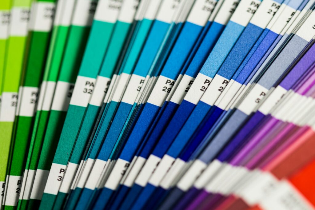
- Utilizing hex codes for precision in color palette ideas ensures that each hue, from pale cyan to plum blue, complements the overall design seamlessly.
- A monochrome color palette, enriched with shades of color blue and touches of dusty gold, offers a sophisticated and cohesive look for those seeking elegance in simplicity.
- Incorporating colors in the palette that range from the vibrant depths of turquoise to the subtle warmth of cream can elevate ideas for decorating your house, making each room a reflection of personalized sophistication.
- Experimenting with unexpected color combinations, like pairing the softness of cookies with the rich tones of plum blue or the freshness of pale cyan, can create a unique and inviting ambiance.
What is a Light Blue Color Palette and Its Significance?
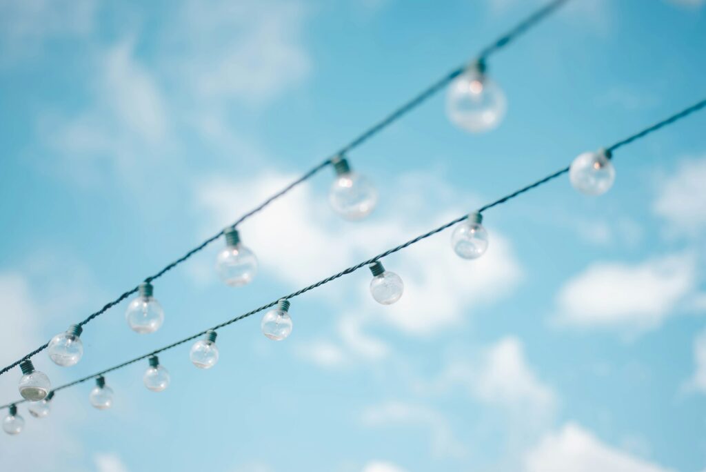
Light blue, a delicate and soothing color, is associated with qualities like tranquility, peace, and clarity. Understanding the psychology behind this color can provide valuable insights into its impact on human emotions and perceptions. The various shades in the light blue palette, such as pastel blue, pale blue, and sky blue, offer a versatile range of options for designers to work with.
Comparing light blue to other colors in the palette, such as green, pink, or grey, shows the unique harmony and contrast it creates when combined. Each shade of blue brings its own meaning and complements different colors in a color scheme.
How to Create an Effective Blue Color Palette?
When creating a blue color palette, it’s essential to select complementary colors that enhance the overall visual appeal. By utilizing different shades of blue like baby blue, cornflower blue, and navy blue, you can add depth and dimension to your palette. Incorporating light blue into your color scheme requires careful consideration to maintain balance and harmony.
Consider factors like symbolism and meanings associated with light blue, along with ways to evoke specific emotions in your design using this calming color. Analyzing successful design projects that incorporate light blue can offer inspiration for your own creative endeavors.
Why Choose a Light Blue Color Palette for Your Design Project?
Choosing a light blue color palette for your design project can convey a sense of trust, professionalism, and reliability. Understanding the symbolism and meanings associated with light blue can help you communicate your brand’s identity effectively. By using light blue to evoke emotions like peace or freshness, you can create visually appealing designs that resonate with your audience.
Exploring examples of successful design projects that have utilized light blue can offer insights into how this color can be applied in various contexts. Whether in wedding themes, web design, or branding, light blue has a versatile nature that adapts well to different design requirements.
Exploring Popular Light Blue Color Palettes in Graphic Design
In graphic design, light blue is often used in various color schemes to create different visual effects. Analyzing different types of blue color schemes, such as monochrome or complementary palettes, showcases the versatility of light blue in design. Its impact on web design palettes can significantly influence user experience and brand perception.
Building a cohesive color library with light blue as a base involves exploring different shades and combinations that work harmoniously together. Whether in a sea-inspired theme or a powder blue aesthetic, light blue offers a wide range of possibilities for designers looking to create visually appealing graphics.
Using Light Blue Color Palette on Social Media and Digital Platforms
On social media and digital platforms, utilizing a light blue color palette can help create eye-catching graphics that attract attention. Best practices for incorporating light blue into your Pinterest boards involve creating a curated collection of blue shades that align with your brand’s image. By incorporating shades like teal or cyan, you can enhance the visual appeal of your online presence.
Attracting attention with a well-curated collection of blue shades involves considering factors like color matching and ensuring a cohesive color palette. Whether in decoration ideas or branding strategies, light blue offers a refreshing and inviting color choice that resonates with audiences across various digital platforms.
Expert Comment
In an insightful commentary on the evolution of color trends in home decoration, Dr. Isabella Marquez, a distinguished figure in the realm of interior design and color theory, shared her expert analysis.
Dr. Marquez begins by emphasizing the significance of selecting the right palette for creating atmospheres that are not only aesthetically pleasing but also evoke specific emotions. “When we enter a room, the colors paint an immediate picture,” she notes, pointing out how a carefully curated selection can transform a space.
She highlights the resurgence of teal color and plum brown as pivotal in bringing both warmth and depth to interiors. These colors, according to Marquez, are excellent for accentuating spaces without overwhelming them. “Incorporating blue palettes with color ideas that lean towards cold shades like dark-blue and silver cyan offers a dreamy, heavenly touch that’s both gentle and peaceful,” she explains. This approach aligns with her recommendation for those seeking color ideas for decoration, where a mix of soft, pale beige, and the stark contrast of white color can create a soothing ambiance.
Dr. Marquez also sheds light on the importance of the technical aspects of color selection, such as understanding hex color codes in HTML and the role of CMYK values in achieving the perfect hue. “For instance, a color palette created with a mix of grey-cyan and soft plum colors can evoke feelings of tranquility and sophistication,” she illustrates. This meticulous selection process ensures that the colors in the palette resonate with the desired mood, whether it’s the coziness reminiscent of Christmas or the eerie allure suitable for Halloween.
Moreover, she advises on the practical side of decorating, especially for touch device users who explore by touch. “The tactile experience of materials can be as influential as their color. Hence, the cold, soft textures should be as carefully considered as the visual elements,” Marquez suggests, underlining the holistic approach to designing inviting spaces.
When discussing seasonal decorations, Dr. Marquez recommends a blend of warm brown colour tones with the serene and dreamy shades of blue and grey for a balanced and inviting look. “The selection of colors for your palette should consist of hues that not only complement each other but also adapt to different themes, from the gentle whispers of a snowy Christmas morning to the soft, dull echoes of a candle-lit Halloween evening,” she states.
Her advice for those seeking ideas for decorating their house is to start with a base of neutral tones and gradually layer in colors like plum color or a splash of cold, dark shades for depth and character. “This method allows for an adaptable palette that can easily be refreshed with different accents or for various occasions,” she adds.
In conclusion, Dr. Marquez encourages decorators and homeowners alike to embrace the full spectrum of color ideas for decoration, from the bold and cold to the dreamy and serene. “The beauty of design lies in the endless possibilities that colors offer. By understanding the emotions and atmospheres that different shades can evoke, we can create spaces that are not just visually appealing but also emotionally resonant,” she affirms, highlighting the transformative power of a well-chosen color palette.
Dr. Isabella Marquez
Conclusion on Light Blue Color Palette
In summary, leveraging thoughtful color combinations and palette ideas can breathe life into your living spaces, from tranquil sea-inspired hues to rich plum blues. By mastering hex codes and exploring diverse shades, you can craft your perfect home aesthetic. Now it’s your turn to RGB your colors in palette for ideas for decoration your house!
FAQ on Light Blue Color Palette
A palette that matches light blue beautifully includes soft yellow, gentle purple, and creamy white, offering a fresh and inviting look ideal for decorating your house.
A light blue color palette can include codes like #ADD8E6 (light blue), complemented by #FFD700 (yellow) and #9B30FF (purple), enriching the colors in the palette with vibrant contrast.
Colors that symbolize freedom often include bright yellow for optimism, sky blue for openness, and vibrant purple for creativity, offering a dynamic palette for expressive decoration ideas.
Complementing blue, warm yellows and soft purples add contrast and depth, enhancing the rgb spectrum of your palette and bringing innovative ideas for decorating your house to life.