How can the many shades of brown enhance your designs and spaces? From the rich warmth of earthy hues to the understated elegance of muted tones, brown color palette offers a versatile palette that can transform any project. Whether you’re decorating a home, designing a website, or crafting a wardrobe, brown is incredibly adaptive.
Key Takeaways
- Brown color palettes can create a warm and inviting atmosphere in interior design, enhancing both comfort and aesthetic appeal.
- Incorporating brown in web design can convey stability and a natural feel, suitable for brands emphasizing organic or eco-friendly messages.
- Brown is effective in corporate branding, where it is used to project reliability and strength, essential for building trust.
- A variety of brown shades in fashion accessories offer timeless elegance and versatility across different styles and seasons.
- Using brown in artwork can evoke deep emotional responses, connecting viewers to traditional themes and nature.
- Brown backgrounds in photography can emphasize the subject, providing a natural contrast that enhances overall composition.
How to Use Brown Color Palette
Crafting Warm and Inviting Living Spaces with a Brown Colors in Palette
When designing living spaces, a brown color palette can add warmth and comfort. By using shades like espresso, caramel, and beige, designers create inviting environments.
The combination of brown with soft furnishings and natural elements like wood can enhance the coziness of the area. This approach is ideal for living rooms and bedrooms where relaxation is paramount.
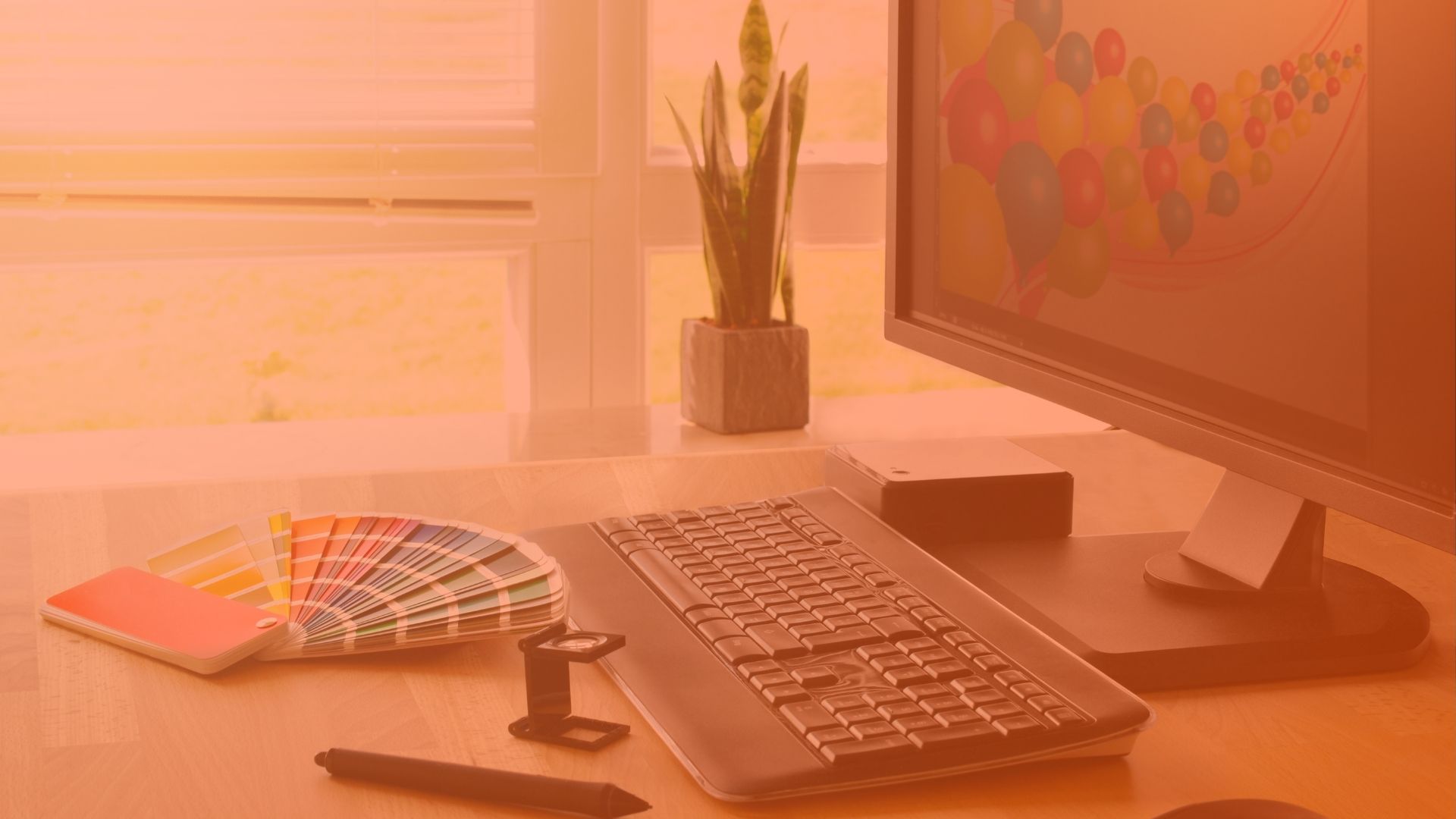
Enhancing Web Design with a List of Brown Shades for a Natural Look
For web designers, utilizing brown shades can evoke a sense of reliability and earthiness. When a color palette created specifically with HTML and hexadecimal codes like hex #8B4513 or #A52A2A is applied, the result is visually grounding. This palette works well for organic or eco-friendly brands, providing a natural aesthetic that appeals to eco-conscious consumers.
Utilizing Brown in Corporate Branding to Convey Stability and Dependability
In corporate branding, brown can communicate stability, reliability, and strength. Companies often choose brown for logos, uniforms, and marketing to project a grounded and robust image. This approach is particularly effective in industries like construction, coffee, and legal services, where trust and reliability are crucial for customer relationships.
Implementing Brown Tones in Graphic Design for Rich and Deep Visuals
Graphic designers find brown tones versatile for creating depth and richness in visuals. When used in backgrounds or as part of a color scheme that includes contrasting colors like blue or green, brown can make other elements pop. This technique is useful in advertising, where attracting the viewer’s eye and conveying a message quickly is essential.
Designing Fashion Accessories Using Brown for Timeless Elegance
Fashion accessories like belts, bags, and shoes often feature brown to capitalize on its timeless elegance. Designers use various shades of brown to ensure that these accessories remain versatile across styles and seasons. For example, a dark chocolate leather bag can complement almost any outfit, adding a touch of sophistication without overpowering the look.
Crafting Palettes for Home Decor Using Brown to Create Cohesion
Interior decorators often use brown as a base color to create cohesive color schemes in homes. By mixing different shades of brown with complementary colors, one can design spaces that feel balanced and harmonious. For example, pairing lighter browns with blues and greens can create a serene and welcoming atmosphere, ideal for spaces meant for relaxation.
Using Brown in Artwork to Evoke Emotion and Tradition
Artists use brown to evoke emotions and connect with traditional themes. In artwork, brown can represent the earth, depicting stability and endurance. It’s commonly used in landscapes or portraits where the artist wants to convey a sense of timelessness and grounding. This approach can add a profound emotional layer to the piece, making it resonate more deeply with viewers.
Selecting Brown Shades in Photography to Highlight Subject Matter
In photography, brown can help highlight the subject matter by providing a natural and soft background that does not distract like a black one. Photographers often use brown in the backdrop or in elements like clothing to make the subjects stand out. This is particularly effective in portrait and nature photography, where the focus is on capturing the essence of the subject or the environment.
Brown Color Palette: Best Practices
Understanding the Richness of Brown and Its Implications in Color Design
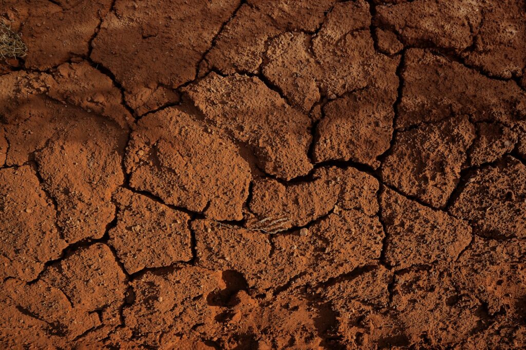
Brown is a warm and earthy color, often associated with reliability, nature, and earth. This great color evokes a sense of warmth and comfort, making it a popular choice in various design fields. From the deep hues of chocolate to the light tones of beige, the brown shades carry an inherent richness that can transform a space or design.
How to Effectively Utilize the Brown Color Palette in Interior Decorating
When you want to create a cozy and inviting atmosphere, brown is your go-to color. It works beautifully in spaces where comfort is key, like living rooms and bedrooms. Combining different shades of brown with soft textures can result in a soothing ambiance. For a more dynamic look, integrate shades of blue or green, which will contrast nicely with the warmer tones of brown. The hexadecimal color 964b00, a deep brown, can serve as a stunning accent wall color, enhancing the room’s depth.
The Role of Brown in Fashion Design: Creating Timeless Pieces
In fashion, brown is as versatile as it is in interior design. It pairs well with a wide range of colors, including soft taupe, rich gold, and vibrant red. A brown leather jacket or a pair of taupe boots can anchor an outfit, providing a classic look that never goes out of style. Fashion designers often use brown as a base color, allowing them to build outfits with various complementary colors like yellow or cyan.
Brown Color Palettes in Web and Graphic Design: Conveying Stability and Warmth
For web and graphic designers, brown can convey a message of stability and warmth. It’s a great color for brands that want to associate themselves with earthy, organic, or vintage themes. Using brown in combination with colors like magenta or cyan can make digital designs feel more grounded and balanced. The RGB color space allows designers to find the perfect brown by adjusting rgb values like 0, 50, 100 to match the desired hue and saturation.
Crafting the Perfect Brown Color Palette for Weddings and Special Events
One of the best brown color palettes ideas for a wedding involves combining it with hues of green and touches of gold. This color scheme creates a romantic, yet earthy vibe. For those who see more ideas for their special day, exploring brown color combinations on platforms like Pinterest can provide further inspiration. The result is often a beautiful brown color palette that adds a unique touch to any event.
The Influence of Brown in Artistic Media: Evoking Emotion and Depth
Artists value the variety of emotions that brown can evoke. From the soft, muted tones that suggest a quiet solitude to the robust, dark shades that bring about feelings of strength and endurance, brown is a dynamic choice. It is also known for its ability to improve the depth and complexity of an artwork by providing a background that enhances the brighter, more vibrant colors.
Conclusion: Embracing the Brown Color Palette for Its Diversity and Warmth
The beautiful brown color is not just another shade in the artist’s palette or the designer’s toolkit; it is a versatile and dynamic choice that can transform a space, a piece of art, or an outfit. Whether you are looking to create a warm and inviting home, a stylish wardrobe, or a compelling website, consider the brown color palette for its ability to offer variety, warmth, and reliability in every stroke or pixel, and combine it with e.g., gold color palette.
Red and green are color names and cmyk values that touch device users to explore by touch. But from 2018, this might consist of more primary colors together for a consistent hue angle and lightness degree.